Customizing devices of all sorts to look like other devices is nothing new. Heck, I used to be fairly active on a forum board that specialized in theming a modified version of Windows 98, oftentimes to mimic other operating systems. As time has gone on software developers have grown increasingly unfriendly towards this kind of customization, and in general the latest technology looks pretty decent to begin with, but one bastion of personalization that practically everyone is familiar with is Android. And yet, while Google’s ubiquitous platform is ripe as can be for some pretty radical modifications it can be rather difficult to find any significant change of pace that isn’t a joke app or a step down from the spartan usability of the default Android launcher.
If that last sentence has you expecting an “until now”, you’re dead on…but you may still be a bit surprised at what you get. It’s an unlikely candidate for ‘best alternative Android launcher’ in many ways, from being branded as a fake imitation of another mobile operating system to bearing the stereotypical inauspicious traits of cheap Chinese software development, but beneath the rough edges lies one of the most attractive, most usable, and surprisingly most original launchers currently available on the Google Play Store. Have a look at Launcher 8.
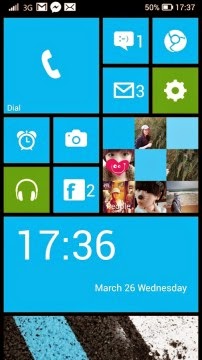
 As the name implies (and a single screenshot instantly gives away), Launcher 8 recreates the look and in some ways the functionality of Windows Phone 8’s live tile UI on recent versions of Android. The developer even put “(fake wp8)” in the app’s title, so there’s absolutely no question that this is intended to be a ripoff (or homage, if you will). And for some, this is exactly what you’re looking for. And why not? Despite all the hate Microsoft has gotten for their Metro (now ‘Modern’) UI, the cultural impact it’s had is undeniable. Flat is officially ‘in’, Microsoft was one of the first to push for it, and they first pushed for it on Windows Phone. And for mobile it really makes a lot of sense. Large buttons are much easier on the fingers for touchscreens, and as a side effect they occupy a small screen more cleanly and attractively than rows of tiny icons. Launcher 8 does a terrific job at preserving all the best points of Microsoft’s design language, even though it has the added challenge of functioning on a wide range of screen sizes and resolutions. If you want to transform your Android to look like Windows Phone, look no further. Launcher 8 nails the visual appearance and layout from the home screen to the app launcher, and even includes an optional lock screen and replacement status bar to complete the package. You will probably want to steer clear of those last two options, however, as they are a bit hackish and didn’t work very well on either device I’ve been using Launcher 8 on for the last several months. More often than not the lock screen was excessively laggy and didn’t actually unlock the device—just opened me up to the default Android lock screen. The status bar on the other hand actually suffers from being too close an imitation to Windows Phone, eliminating the Android notifications menu—which is just not something I’m willing to sacrifice for flatter icons and some nifty animations. But again these features are purely optional and can be easily switched off entirely in the application settings.
Which brings me to the point I really want to focus on: customization. While I initially checked out Launcher 8 for its Windows Phone likeness, over time I found myself gradually departing from anything resembling Windows Phone to craft my own experience that’s not precisely like anything else out there at all.
 While there are a few built-in ‘live tiles’ in general they leave a bit to be desired, but in their stead you can also use standard Android widgets. Finding widgets that blend in with the tile-based UI can be tricky, but if all else fails you can just set the widget background to be transparent so it appears to float like it would on the default Android launcher. In fact, each and every tile can have its own unique background color, icon and icon alignment, and label. Unlike actual Windows 8-based UIs, Launcher 8 imposes no real restriction on tile size, either. While editing tile size straight from the home screen only cycles through a few simple presets, entering the full editing menu allows for a great variety of tile sizes, even vertically rectangular ones that would be impossible on Windows Phone or Windows 8. You even get some say in how many tiles to fit on the screen in the first place. Too much work to go through for each individual tile? No problem! Just set them all at once from the application settings for a more uniform appearance.
It’s also worth mentioning that you don’t have to endure Windows Phone’s single-column app drawer either, with two styles of grid options available as (in my opinion, far more comfortable) alternatives.
Of course, having so many different tweaks and options available means that there is a bit of a learning curve to Launcher 8, and unfortunately the preferences interfaces aren’t as sharp as the launcher itself, but it is well worth enduring both for the results that wait on the other side. Thankfully there is a well-populated library of themes submitted by other Launcher 8 users to get you started with minimal effort. A surprising majority of these themes are pretty striking or just downright cool, and I will openly admit I pulled a lot of ideas from other people in forming my own design after trying out several of them.
As I mentioned earlier, I’ve been using Launcher 8 for several months now, and I don’t intend to go back anytime soon. The base Windows Phone tile paradigm feels good on touchscreens, and the amount of aesthetic personalization far exceeds more popular Android launchers that ultimately don’t deviate much from the safe and familiar. Though it’s unfortunate I can’t recommend every feature or commend every design choice within the app itself despite minor imperfections Launcher 8 is still the best and most interesting alternative UI available for Android right now. Best of all, the free version is extremely generous, offering mostly the same features as the paid version and only reminding you to upgrade on occasion with one of the subtlest and least offensive nag screens I’ve ever seen. That being said, Launcher 8 Pro is available for just $1 until August 31st, so snatch it up on the cheap side while you still can (seriously people, it’s only a buck. Support the developers whose work you appreciate)! If you have any interest at all in giving your Android devices a facelift, you can’t go wrong with this one.


