Well, it’s official: Microsoft has pushed out the door what is likely the last build for Windows 8.1 Update 1, set to hit the public on April 8 (whatever could have made them choose that day?). The name may imply that not much has changed—and truly that is the case on the system level—but Update 1 actually brings a fair amount of UI tweaks particularly targeted at keyboard and mouse users. Yes, Microsoft is still designing Windows 8 for you. But is Update 1 the patch that will finally let desktop users breathe a sigh of relief, or will it only contribute to their woes? Unfortunately, the answer is: both.
For the rundown, Update 1 features:
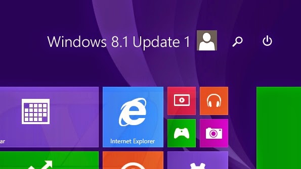
• Power and search buttons on the Start Screen (should’ve been there from day 1)
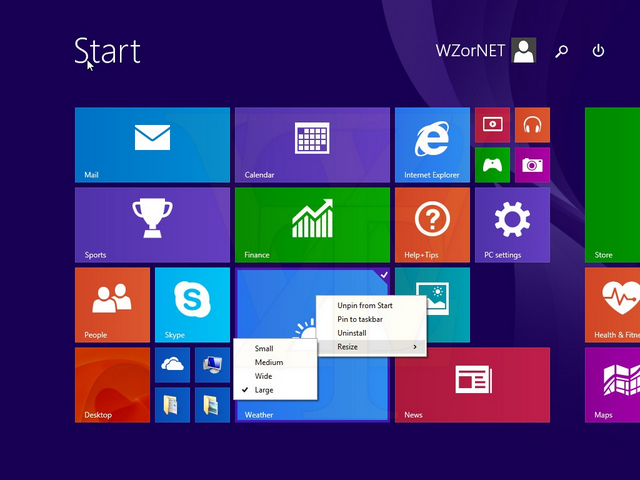
• Traditional context menu on Modern apps (keyboard/mouse only)
• Pinning Modern apps to the taskbar (no more weird shortcuts needed!)
• Displaying running Modern apps on the taskbar (all your open apps in one place, desktop users)
• Access to the taskbar from anywhere (more on that in a bit)
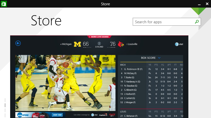
• Window buttons on Modern apps (again, only when using a keyboard/mouse setup)
• ‘New app’ notification on Start Screen (compensates for 8.1 not automatically piling on the tiles automatically)
• Smaller icons in ‘Apps’ view (optional, only recommended for large screens, still looks like a cluttered mess)
• Jump to desktop when all Modern apps are closed (see below)
• SkyDrive is now OneDrive (yippee?)
And for the record, Update 1 does not feature booting straight to the desktop—not because that functionality isn’t there, but because it’s been there ever since the first version of 8.1. Somehow the internet at large has been duped into thinking they need an update to boot to desktop, but this is patently untrue. However, it’s hard to blame anyone for not realizing it, considering the option is awkwardly tucked away in the properties menu of your taskbar. What Update 1 adds in this regard is simply going to desktop when all Modern apps are closed in addition to the existing boot to desktop functionality. Are we clear now? Good. Moving on.
As you can see, all of these features boil down to basic UI tweaks, and if you primarily navigate Windows 8 with a touchscreen, you may not frequently encounter the differences at all (aside from the power/search/new app notification parts). Initially after installing Update 1 on my own PC I was pleased; unification of the running apps list is something I called for since the Windows 8 beta, and I’ve long been forging my own path to shortcutting modern apps on the taskbar. By now I’ve grown accustomed to powering off my PC via the charms menu, but it just makes sense to have the power icon on the Start Screen and it’s something I welcome and intend to use on a daily basis. Unfortunately as I’ve spent time with Update 1 I’ve come to realize that for every step forward it takes, it falls back in equal proportion.
All running Modern apps show up on the taskbar now—good. But the reverse needs to also be true, so desktop apps can be seen running in the Modern app switcher. Even better would be to disable the app switcher altogether while using a mouse and keyboard, and move its functionality over to the window preview thumbnails instead. I found myself trying to click and drag the thumbnails we’ve had since Vista to pin the apps on one side of my monitor or another, but of course to no avail. However, since these incidents I’ve come to wish it was an actual feature. For desktop users, it makes sense. The Modern app switcher is just a list of thumbnails, but we’ve already got that on the taskbar. Microsoft would do well to trim the app switcher fat for the mouse/keyboard setup and show running desktop apps in it for a touch screen setup. As it stands now, Update 1 renders an old Windows 8 feature unnecessary for non-touch users, but doesn’t eliminate it. It’s just junk occupying screen space.
Then there’s the window controls on Modern apps. Of course you can’t restore/maximize something that must be run in fullscreen, so your options are just close, minimize (essentially ‘switch to desktop’), and a context menu that allows you to split the app view or handle the aforementioned two functions. The first problem with the setup is that it just feels awkward. The mouse no longer turns to a hand to indicate you can drag the app around the screen to snap it or close it down, and it’s eminently plain that Modern apps were never designed to have a titlebar across the top of the screen. But worse is that it potentially conflicts with another aspect of Update 1: the ‘access-anywhere’ taskbar. Like many other PC users out there I prefer to place my taskbar at the top of the screen, even though the default positioning for Windows has always been the bottom. Because Modern apps are designed to run in fullscreen, the new titlebar autohides when not in use. How do you bring it back into view? Easy: you move the mouse to the top of the screen. But how do I bring my taskbar into view? You guessed it: I move the mouse to the top of the screen. The result is a wild and shockingly amateur-looking conflict of two menus jumping in and out and on top and underneath one another. Of course if you stick with things as they’re shipped you’ll never encounter this issue. But that’s not what Windows is about. It’s never been about a one-size-fits-all experience. Users have lost a lot of control over Microsoft’s OS over the years, but for crying out loud, we ought to still be able to put our taskbars where we want them without it clashing with another part of the OS.
It’s also worth mentioning that while the context menus in the Start Screen work fine, they just look strange. The Start Screen is the heart and soul of the Modern UI, except now it breaks its own design language. The only benefit of the new context menus over the old is familiarity—neither is more usable than the other. I understand the hate continues to rage against Windows 8 and people are beginning for a return to form, but this just isn’t the way.
In fact, that’s the overall impression I get about Update 1: this is what happens when enough people complain that Microsoft tries to cater to them without outright abandoning its own plans. The result is an unpolished, poorly thought-out tribute to the traditional PC users that have funded Windows to bring it where it is today. The aim may have been to enhance the mouse and keyboard experience, but ultimately I just feel pressured to join the touchscreen crowd. It’s a more comfortable, more consistent world there.
